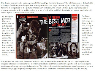
I liked the colour theme on this double page spread of red,white and black. I thought that this looked interesting as it is mainly filled with photographs and their is actually very little text. Although this makes the double page look eye-catching when i create my own i will use more text and less pictures as i think that this looks better and is more interesting for the reader.

No comments:
Post a Comment